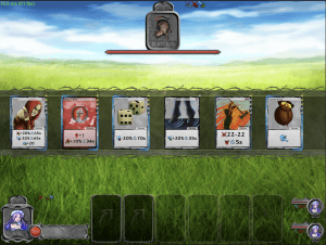
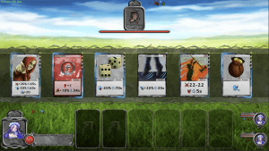
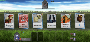
… have you ever wondered how a game or app works on multiple devices, even though these devices all have different operating systems, architectures and aspect ratios, etc.? Probably not … because the user cares about one thing only: it should just work 🙂
However, after I decided to offer the game across 3 major platforms (iOS, Android and Windows), it was obvious to me as a programmer that thus will be a big challenge. But why is that?
If we ignore the different operating systems and architectures altogether and focus only on the screen – we notice that cell phones and tablets all have very different aspect ratios. For example a modern iPad is 4:3, standard tablets are mostly 16:9, and modern phones often use 19.5:9 (so they are more than 2x as long as high).


Now you can already imagine that it is not so easy to customize a UI so that it fits optimal on all screens. Some use simpler methods – like the so-called crop-mode (creating left/right or top/bottom black borders – in order to keep the aspect ratio always the same). Or you trick with simple distortions (compress or stretch the entire screen or parts of the screen). Of course, both variants have the disadvantage that you either have annoying borders or the elements in the game become distorted …
That’s why you usually take the time to code individual formats to display different amount of information depending on screen size. However especially in a competitive online game, where players can compete against each other, it is important that no matter what format you are playing in – the experience must be the same for everyone. Now on a 19.5:9 wide screen you could have much more cards visible side by side than at 4:3 – so what to do?


As you can see in the pictures (they show the combat screen), depending on the aspect ratio, UI elements are laid out differently and there are no distortions due to stretching or compression. In addition, the number of game cards displayed simultaneously on the screen stays the same and there are no annoying black bars. However, what looks very simple here is relatively complex in terms of software development. Since a computer is very stupid by nature (it can only compare 2 states with each other) a lot of this stuff has to be calculated in the background, so that it can finally be rendered dynamically and work for all the other formats and resolutions in-between too…
Hope you got a glimpse of one of the many difficulties you are facing in software development. See you next time.

